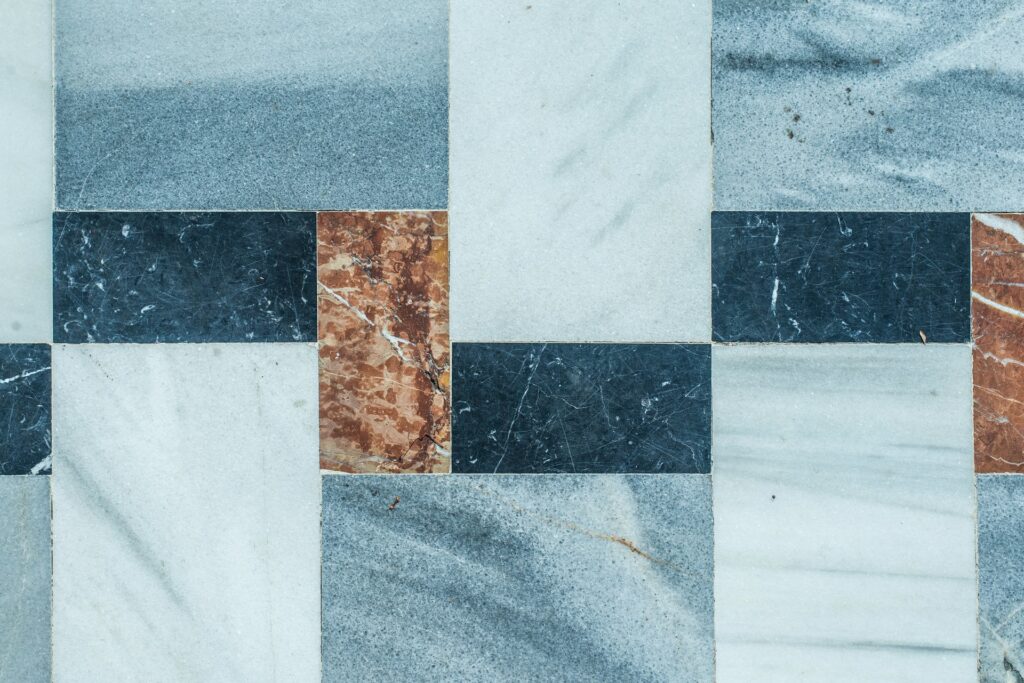
Once you’ve found the perfect tile for your space, it’s time to show it off with an eye-catching layout. The options are good and plenty, and an expert use of tile laying patterns can truly elevate the interior design of your home. That’s why we’ve put together a guide to tile laying patterns to help you explore some gorgeous tile ideas. In this post––the first of Cosmos SurfacesTM’s two-part guide––we’ll explore the most popular single-tile and two-tile patterns.
SINGLE-TILE PATTERNS
If you’ve chosen a single tile for your walls or flooring, there are still plenty of options to play around with the layout. We’ll note here that “single-tile” refers to tiles that are of the same shape, color, pattern and size (tiles that look the same but consist of two different sizes fall under two-tile patterns, which we’ll discuss later in this post).
Classic Brick Layout
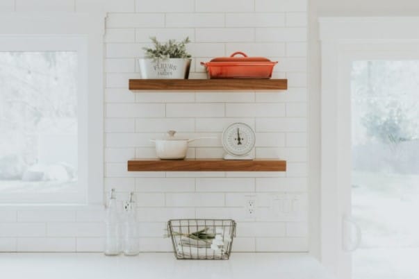
This is a layout most of us are familiar with: rectangular tiles are placed in horizontal rows, and each row is offset by half a tile-width. This pattern is timeless, and the resulting horizontal lines can visually widen a room to great effect, making the space feel bigger and more open. The classic brick layout works well where one simple kind of tile is used. Pairing the tile with grout in a contrasting color can help accentuate the horizontal lines and consistent geometric pattern throughout.
Vertical Brick
Much like the classic brick layout, a vertical brick pattern is simply rotated vertically. With this layout, the vertical lines lead the eye upward, creating a sense of height and spaciousness. This is a great way to add a contemporary twist to a classic motif and works well in smaller spaces, like bathrooms or kitchens.
Herringbone
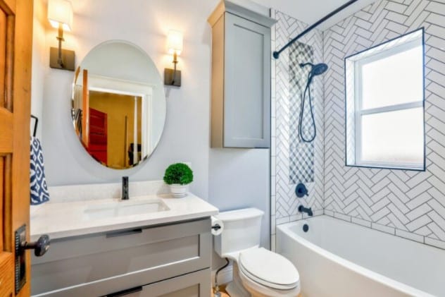
This pattern creates a zig-zag formation by laying tiles at right angles to each other. Herringbone patterns work beautifully on accent walls and add a sense of visual energy. The complexity of the grout lines created by this pattern plays well with simple tiles. The layout can also be used to break up a larger section of walling, flooring, or backsplash. This creates a focal point within a simpler surrounding pattern, such as a classic brick layout. It’s important to note this pattern does require the cutting of tiles as it approaches borders, which can lead to some degree of tile waste.
Stacked
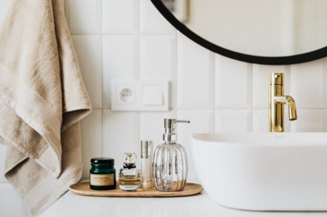
In a stacked pattern, tiles are precisely aligned in a simple, repeating grid. This layout creates a modern look and feel, and its simplistic design has a soothing effect. Stacked patterns work well in modern spaces where clean shapes and straight lines reign supreme. As with a brick layout, bright or contrasting grout can help emphasize this simple, geometric pattern.
TWO-TILE PATTERNS
Introducing a second tile in a different shape, size, color or material can add interesting detail and complexity to any layout.
Hopscotch/Pinwheel
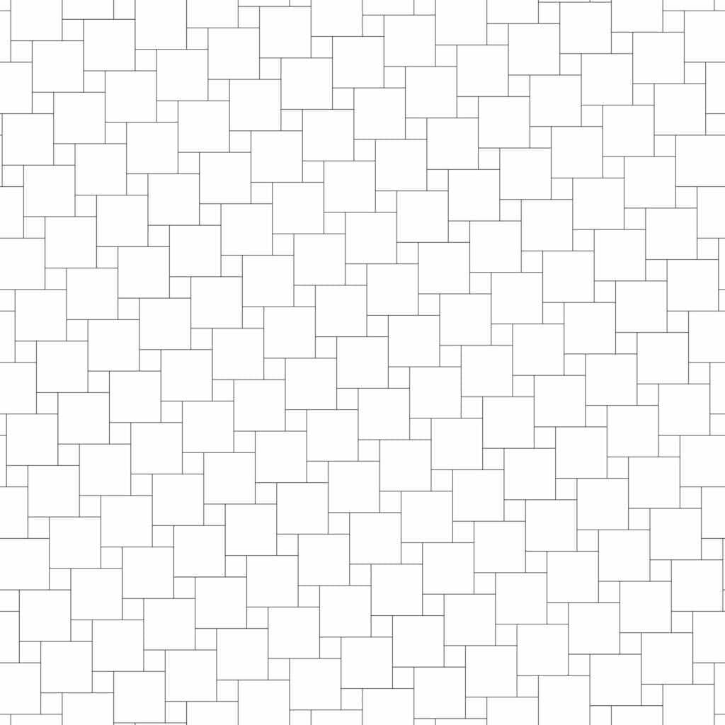
A popular choice for bathrooms and kitchens, the hopscotch––or pinwheel––design uses one large tile with a smaller tile “pinwheeling” around it. While this is a simple design, it still introduces a layer of detail and complexity, especially when a different material or accent color is selected for the smaller tile. Pro-tip: match this accent tile with other textures or colors in the space to pull together different design elements.
Basketweave
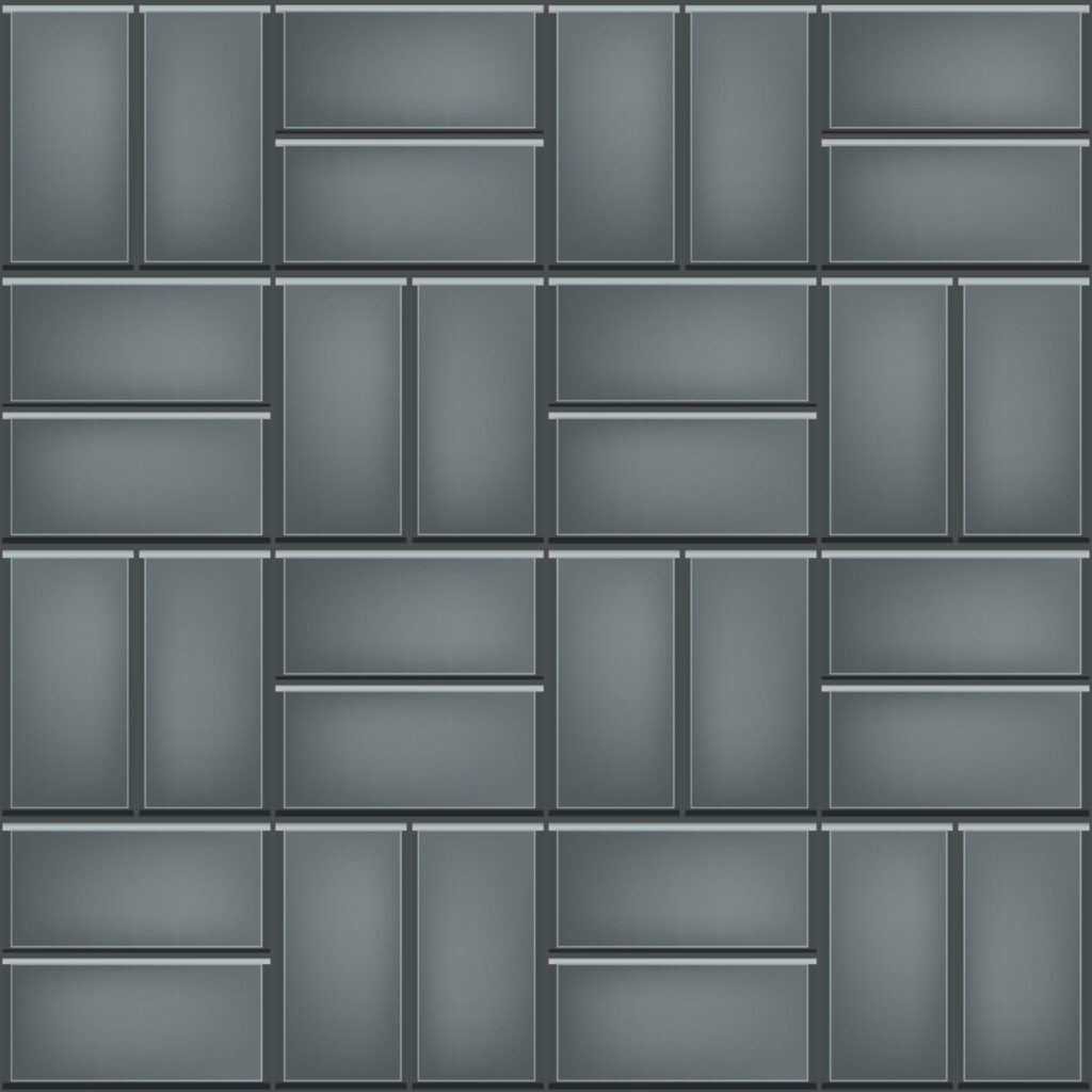
Taking its name from the “woven” effect created by this layout, the basketweave pattern is traditional and timeless. This layout leaves plenty of room to play with different colors and materials. A basketweave pattern can be created either with brick-shaped tiles alone, or with brick-shaped tiles combined with smaller square tiles. Using rectangular brick-shaped tiles alone, stack two tiles horizontally, and the next two tiles vertically.
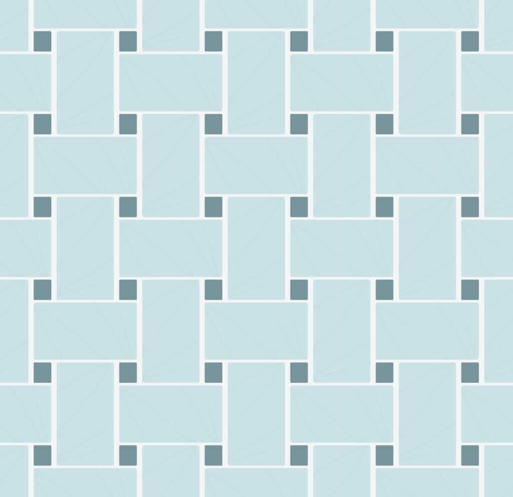
To create a basketweave pattern with rectangular tiles and small square tiles, lay a rectangular tile horizontally and a small square tile at each of its corners. Lay a rectangular tile vertically in the space between the square tiles, and repeat. This pattern will provide an even more textured look and feel.
Windmill
A windmill layout is similar to a basketweave, with smaller square tiles that are half the length of your larger rectangular tiles (if your rectangular tiles are 12” x 6”, your square tiles will need to be 6” x 6”). To build the pattern, the square tile is placed in the center and framed by the larger rectangular tiles to create a “windmill” effect.
Corridor
The corridor layout makes use of mixed-width tiles placed in alternating rows or columns. A popular choice is selecting a square tile and a rectangular tile to alternate rows, but there is plenty of room to experiment with color, width and material.
Tic Tac
In this layout, tiles alternate within the same row, creating a dot and dash pattern. Tiles should be the same width, but with varying lengths––such as squares and rectangles. A tic tac pattern can be installed vertically or horizontally, and the longer the rectangular tiles, the better the visual effect will be. Pro-tip: rows should be offset by one third for the best effect.
Tile Laying Patterns Part 1: Conclusion
This is by no means an exhaustive list of one-tile and two-tile patterns. As you can see, there are plenty of great options to add interesting detail and complexity to your tile layout. In part two of our guide to tile layout patterns, we’ll discuss three-tile, multi-tile and large format tile patterns, as well as gorgeous backsplash ideas.
Cosmos SurfacesTM is a 2nd generation, family-owned business dedicated to providing you with knowledge, meaningful customer service and high-quality surface materials. We offer a wide range of products and resources to assist our customers in all their surface material needs. Contact us today to get started!
Color of the Month: Chive
This month’s featured trending color is Pantone 16-0323, Chive! The Pantone Color Trend Report says, “A savory herbal green, Chive imparts a healthy and restorative harmony.”

Transport yourself to the high seas with the Brazilian quartzite of Del Mare. A seafoam greenish gray, Del Mare conjures a versatile atmosphere. In brighter lights, Del Mare reflects the tranquil, still waters of the Caribbean, while in darker shadows, it paints a stormier picture. Del Mare looks pristine in aquatic spaces. Quartzite is resistant to scratching, staining, and fading, and the beauty is unmatched.


