When we think of tiling as a design element, it’s easy to forget about the grout between those tiles. Grout can play a major role in accentuating or concealing your tile layout, making it a powerful tool in your design arsenal. In today’s post, the experts at Cosmos SurfacesTM discuss how to choose grout color.
Grout Lines: What to Consider
Whether you want to emphasize grout lines or minimize their appearance, there are several considerations to help you choose the best grout for the job. Let’s dive in:
Tile and Grout Location
Consider the location of your tile layout and how visible grout lines will be. Wall tiles and kitchen backsplash are well within the line of sight, which means designs in these areas will be highly visible. This opens up possibilities to create visual center pieces or pops of color with your tile and grout combinations. On the other hand, if you’re dealing with a large surface area, bold color choices can quickly become overwhelming. Decide whether you want a subdued look or an eye-catching accent area, then consider which tile and grout color combinations will help you accomplish your design goals.
The Size of a Tiled Area
The size of the area you plan to tile can help guide your grout color choices. Small spaces can become accent areas where contrasting grout and tile colors will add visual complexity. Conversely, matching tile and grout colors will help create a continuous effect, giving the space a larger appearance.
Tile Design Layout
As mentioned above, grout color can go a long way toward accentuating or blending in with your tile design layout. Let’s look at a few different ways grout color can influence tile layout design.
- Matching Grout and Tile Color—this option helps hide grout lines, creating a continuous, serene look. Matching colors work well in minimalist spaces.
- Contrasting Grout and Tile Color—use a grout color that contrasts with your tile to add visual complexity and accentuate your tile layout or grid pattern. This option works especially well with simple, geometric patterns, such as using black grout with white tiles in a classic brick layout.
- Neutral Grout Colors—for a less bold appearance, you can get the best of both worlds by pairing your tile with a neutral grout color, like grey.
Patterned and Multi-Color Tile
When your tiles themselves have patterns on them, or if you’re making use of a multi-colored tile layout, bold grout colors can quickly become overwhelming. Here are a few tips for these scenarios:
- Use thinner grout lines with patterned tiles (as deemed appropriate by the manufacturer).
- Use a neutral-colored grout to let the tile pattern take center stage.
- For multi-colored tiles, try matching the grout to one of the tile colors for a cohesive look. You might want to start with the most neutral color until you find one that works.
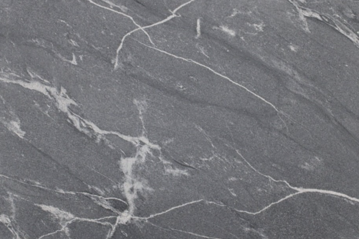
- For tiles with a stone-like appearance, such as veining, you can match grout to either the base tile color, or to the primary veining color.
Match Grout to the Room
Aside from complementing your tile color, grout can pull tones from nearby design elements or appliances. For instance, grey or white grout can match with stainless steel or white fixtures in the kitchen, while grout with red or brown tones can coordinate with wood, brick or stone elements. The overall effect can help create a cohesive color story.
The Shape of Tiles and Grout
The shape of your tiles and the layout you choose can affect the amount of grout you’ll need to use. Square or rectangular tiles, for example, will likely require less grout than more decorative tile shapes, such as penny round tile. Tiles that require more grout means grout lines will be more noticeable. If you want to keep the focus on the tiles themselves, it’s important to match tile and grout colors as closely as possible.
Tile and Grout: A Perfect Match
As discussed earlier, a close color match can help create a seamless, continuous effect. This can make a small space appear larger, or it can allow other design elements in the room to take the spotlight. If you still want your individual tiles to stand out, you can always opt for a textured tile while maintaining a monochromatic color scheme.
Fun with Grout Lines
Neutral tiles can be paired with brightly colored grout for a unique, fun look. This approach works well when the grout color matches with another element, such as a paint color or a distinct color scheme in the room. Unique grout options include translucent grout, which won’t interfere with your tile design, and glitter grout—a playful option that will make your interior sparkle.
Check out our blog for more information on sealing and maintaining grout.
Work with Cosmos SurfacesTM
Cosmos SurfacesTM is a 2nd generation, family-owned business dedicated to providing you with knowledge, excellent customer service and high-quality surface materials. We offer a wide range of tile products and we’re always happy to answer questions and provide expert advice. Contact us today to get started!
Color of the Month: Pacific Pearl
Pacific Pearl is a soothing oyster white with a hint of sea-green undertone. It is perfect for sunny rooms, main walls, and pairing as a trim with any color scheme.
Silver Lightning is a versatile type of granite that looks great among stainless steel and black cabinets. A flashy streak of silver cutting through a mellow gray sky, silver lightning is simultaneously calm and striking. The subtle crystalline texture and honed finish of silver lightning make this a perfect installation for kitchen countertops, floors, and bathroom vanities.